client: fictive project
service: UI design
date: 2023
Festival app design, sparked by a hands-on moodboard
During my erasmus semester in The Hague, I had to design a festival app from scratch. I created a mobile website for a pop festival of one day during the summer. I tried to make my website visual strong and easy to navigate. The target group is from the age of 18.
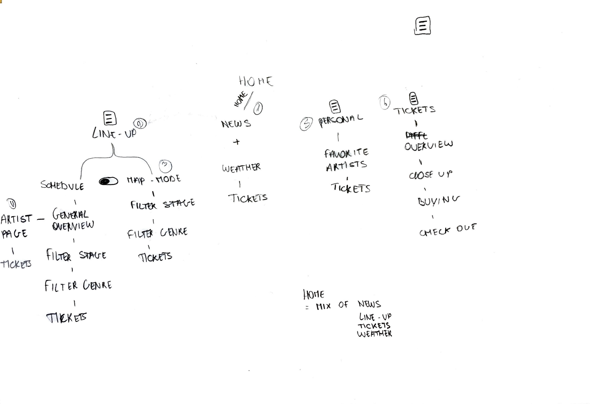
first steps first
Navigation structure on paper
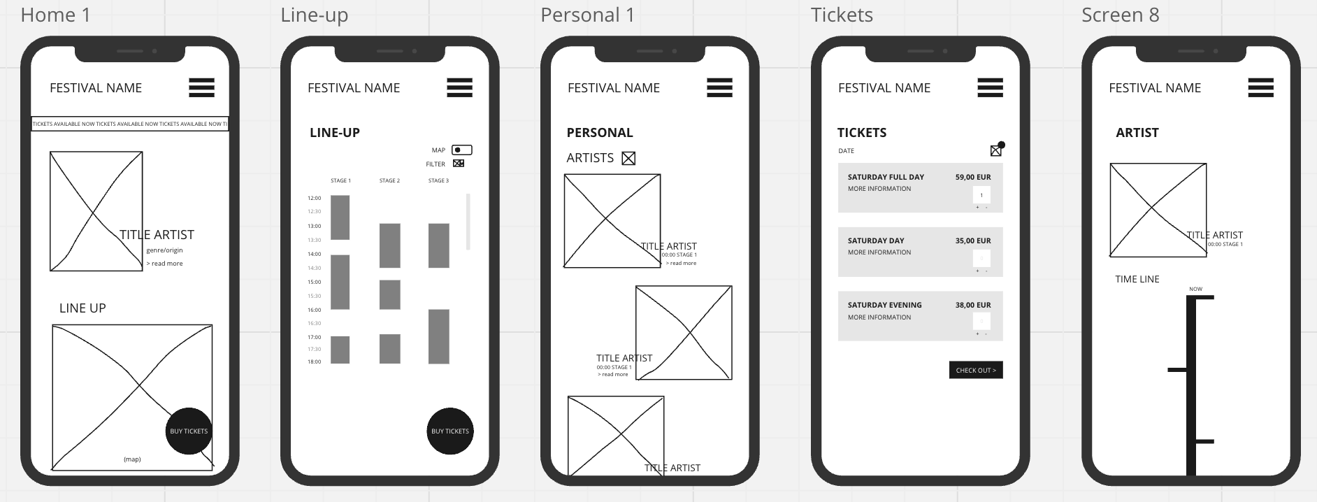
Using Miro for wireframing was mandatory. The wireframes focused on the most important screens and served as a visual guide. They were not yet interactive or functional prototypes.
wireframing
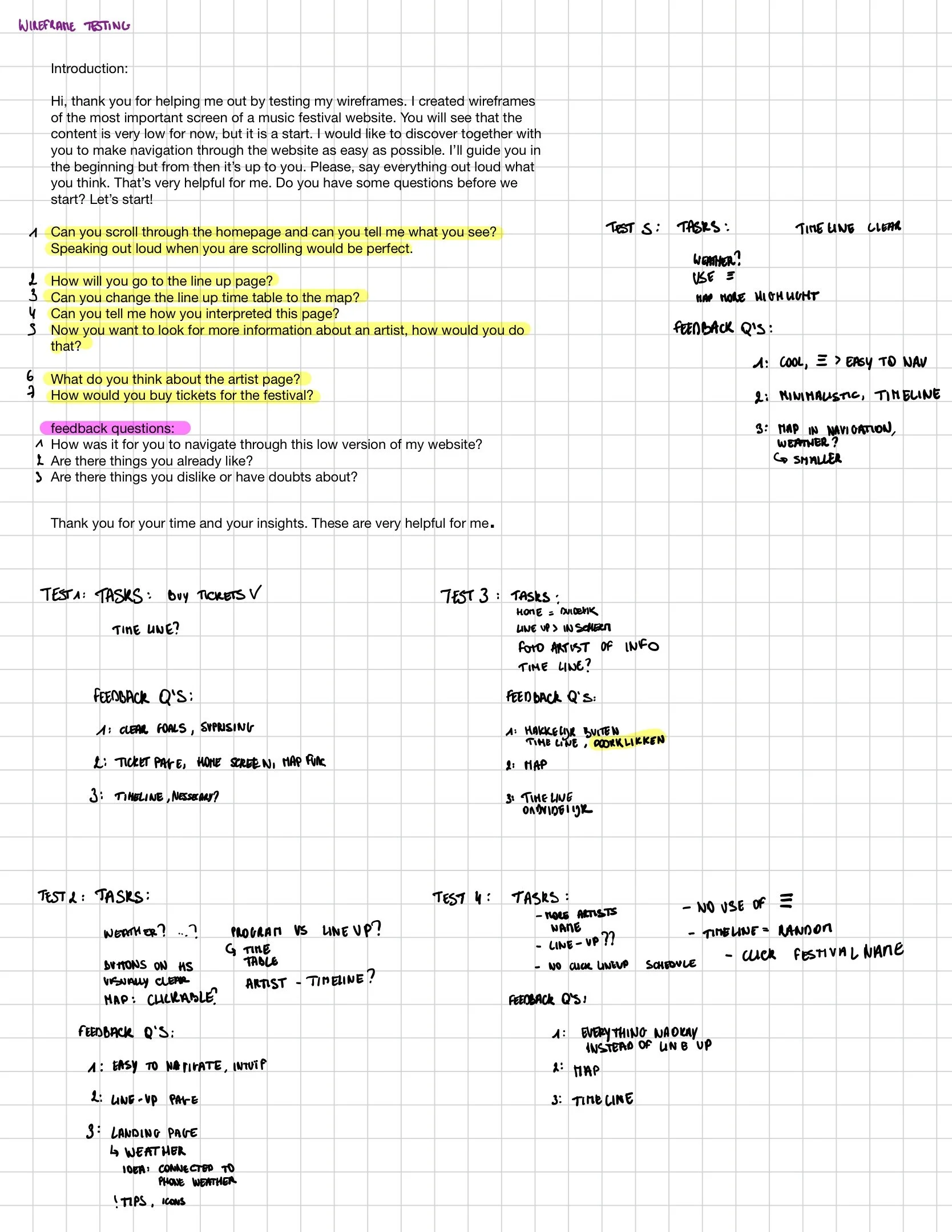
To validate my design, I conducted a testing session with five users. I prepared questions beforehand and carefully observed their interactions, paying close attention to any issues or difficulties they encountered.
For the testing, I displayed screenshots of my wireframes on my mobile phone. The testing helped me identify general insights: the artist page was not clear to my users, whereas navigating through this low-fidelity version felt intuitive overall, which was a positive outcome.
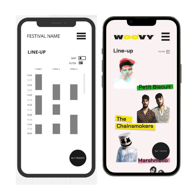
During the second test, there was some confusion around the term “line-up.” While I understood it as the timetable with all artists, this was not clear to everyone.
One striking observation was that my five testers hardly used the hamburger menu, instead navigating through the links on the pages. Based on these results, I switched those wireframes to high fidelity.
testing
Results
Here you can see the the things I changed after the first testing. I implemented them again directly in my first high fidelity version.
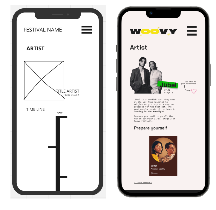
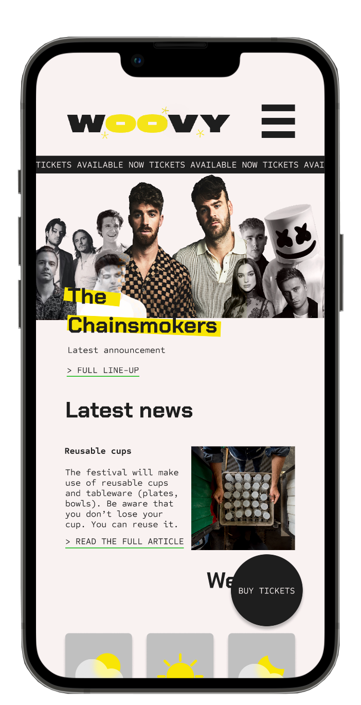
I removed the timeline I had originally included and experimented with a timeline-style biography for each artist. However, after the first round of testing, I realised it wasn’t necessary. Instead, the artist page now shows brief information about the artist along with their popular or latest songs. Each page also includes a link to a Spotify playlist.
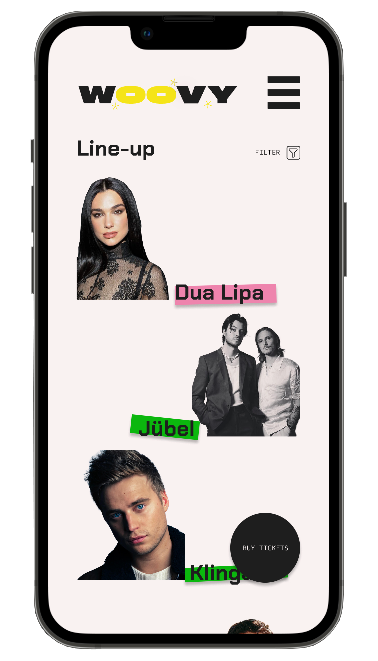
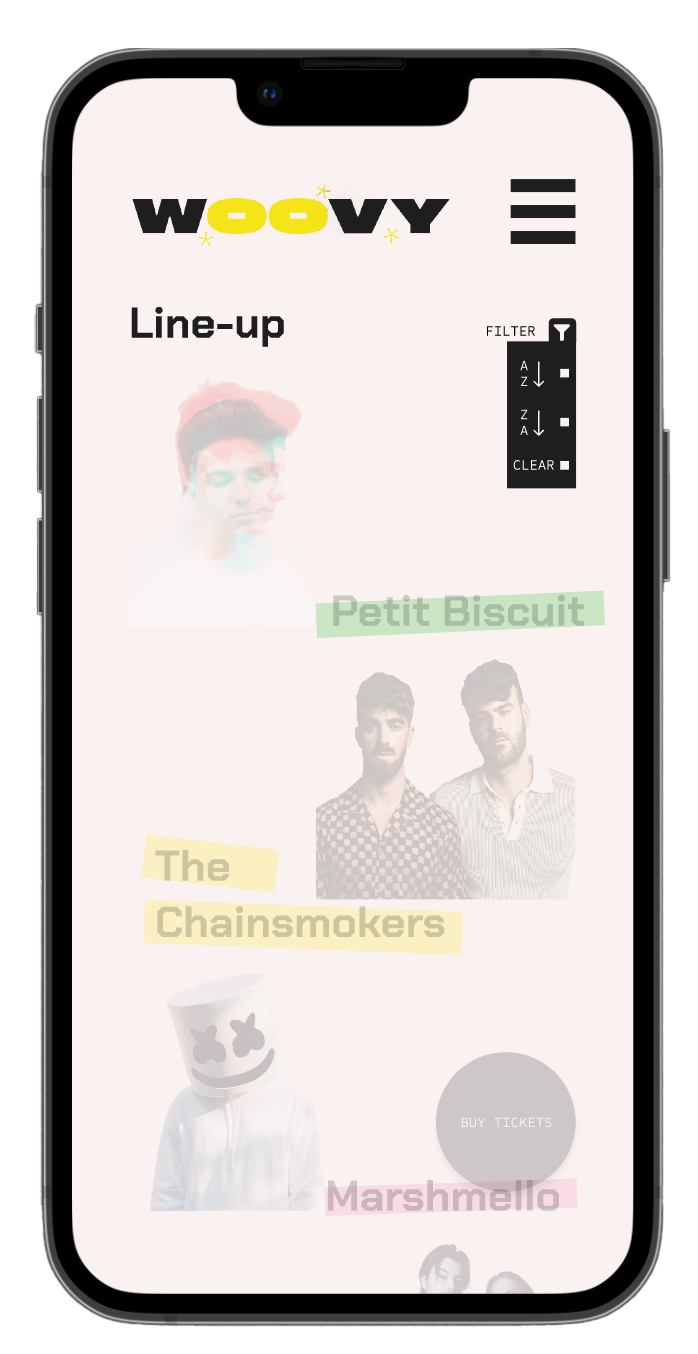
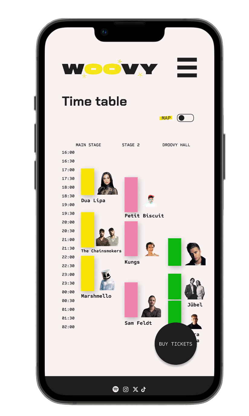
I created an additional page called “Time Table” and changed my Line-Up page to an overview of the artists performing, without including a timetable (right-hand photo). By clicking on an artist, users are taken to the artist’s page. There is also an option to sort the artists alphabetically from A–Z.
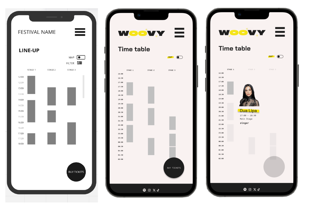
This is the transformation of my Line-Up page into the current Time Table page. The concept remains the same, but it is now hopefully clearer for everyone. Clicking on a time block displays the corresponding artist. On a website, this would work with hover interactions, but that isn’t practical on a mobile device.
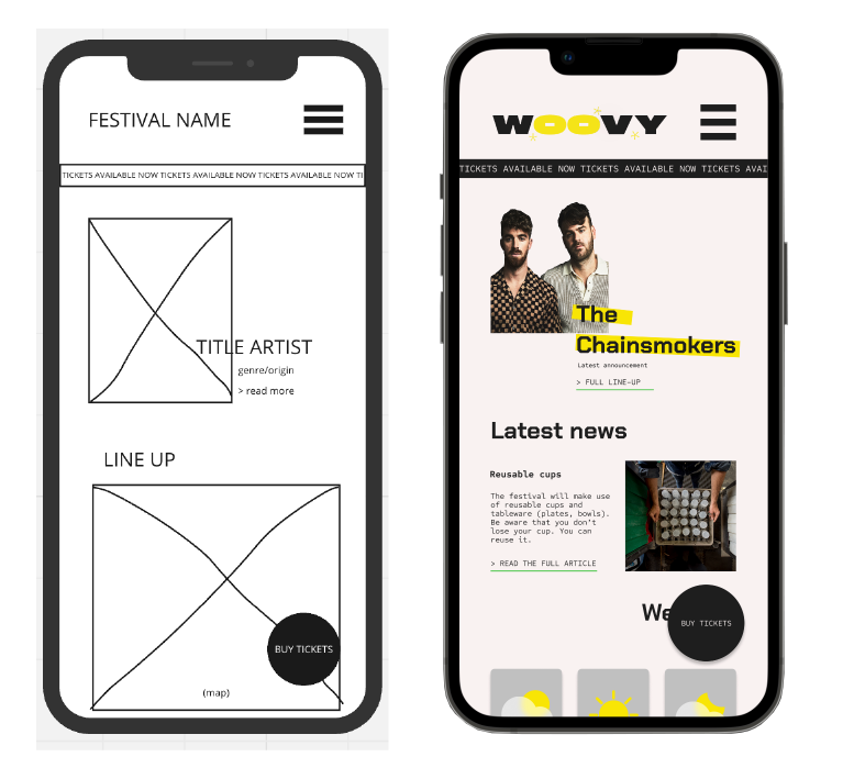
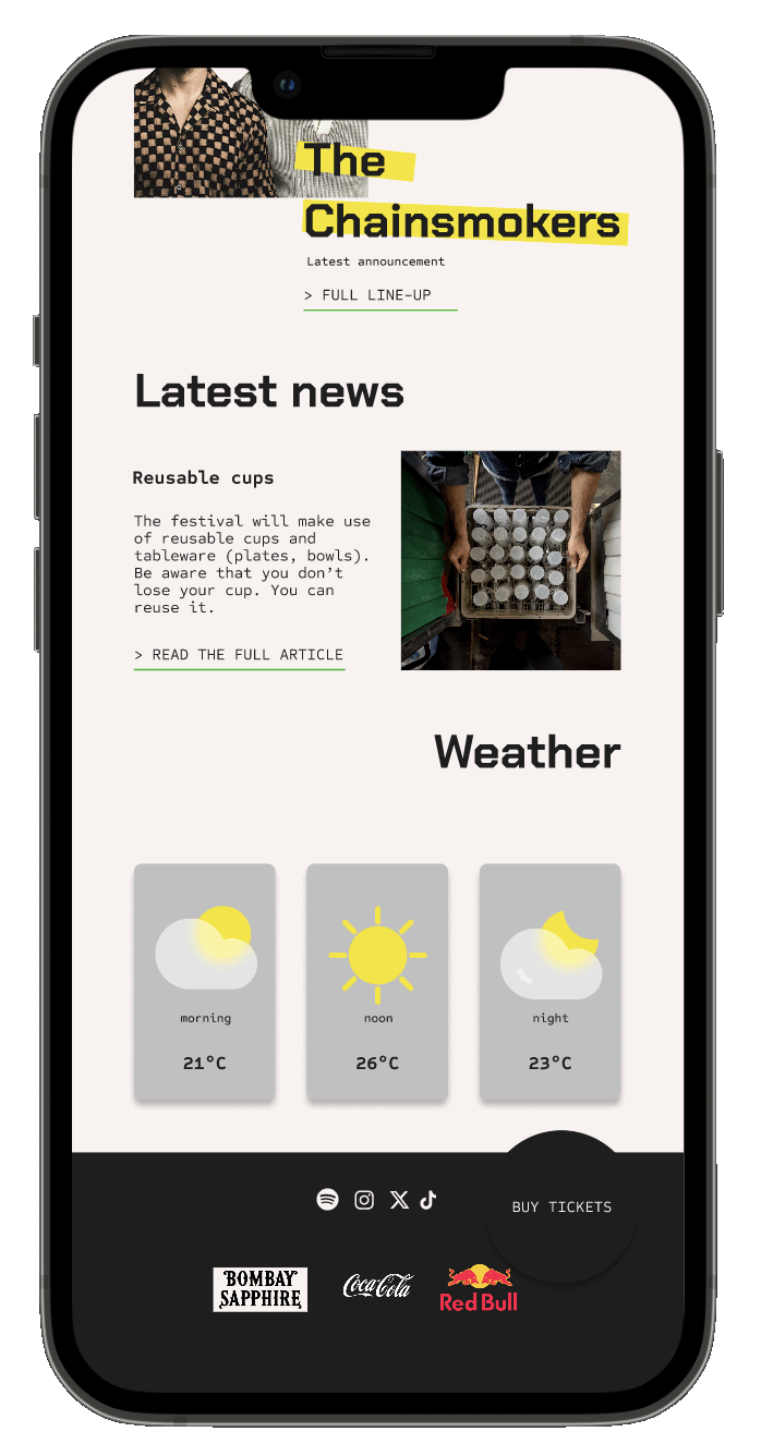
This is the homepage. From here, users can still navigate to the different pages.
Designing the high-fidelity version was a lot of fun, and I feel that my low-fidelity wireframes provided a strong foundation. The most challenging part was coming up with all the content: festival name, artists, news items, and so on. Creating a main brand design guide also took considerable time, but it was still enjoyable to work on.
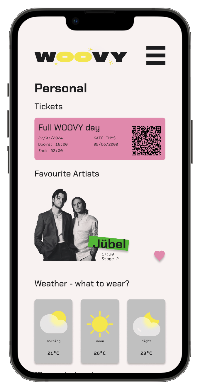
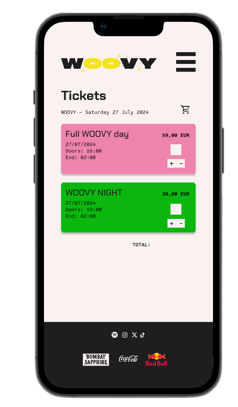
Final screens